Branding, outside in


Branding – what’s all that about? You would think we’d have a pretty good grasp of the concept, it’s been in professional use for decades, for describing… something like identity? Vision?
What, exactly, does it denote? And do you really have to include your audience in a branding process?
Yes, you do. Let’s have a closer look…
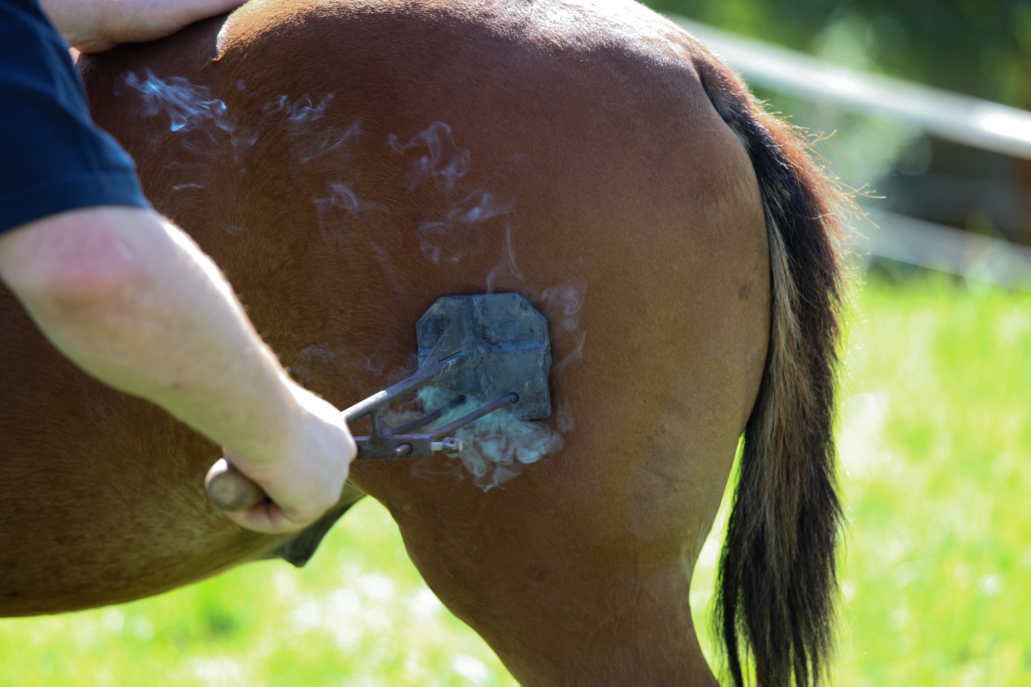
Originally, a brand is simply a mark. An easily recognizable sign – and yes, the word stems from the branding of cattle (among other things). Stripped down, a “brand” could simply refer to a logo or company name: It’s how people know who we are, practically speaking. How you know you’re walking into a Walmart or a Whole Foods.
For at least 20-30 years, however, it has clearly meant something else, something more. Not just how to recognize the company, but also something about how you want the company to be seen. It’s one thing for Walmarts or Whole Foods’es using means beyond just the logo for your recognition – the dedicated brand store is a different beast altogether. A total experience, meant to evoke a battery of desired emotions. At the same time, the logo & color bit itself has been augmented with considerable value signals. “Coke is it” and “Nike – Just do it” are among the most well-known – it isn’t just about recognizing the name. It’s about associating it with something particular and desirable.
This meaning of “brand” has become increasingly important in the last decade plus. Modern consumers are demanding and informed, and the internet and social media spread stories with unbelievable speed.

searching for “rebranding” yields a torrent of images like this…
And yet there’s still a tendency towards branding – and particularly re-branding – meaning just getting a new logo and colors. An expensive exercise, often involving one or more large bureaus – and it’s fooling nobody. Is there a local gas station where you live? If so, it’s probably changed its name more than a dozen times the past five years, and you couldn’t care less. You may even still call it “the Shell station” because that’s what it originally was.
Actually such a process is often underpinned by much more than meets the eye – investigation of missions, vision and values, maybe even new intentions. It’s just that, well, they don’t meet the eye – they never make it out into the world. This is problematic, and not just because it means spending a boat-load of money on something with an abysmal ROI (changing the color of the door sign won’t bring in a single extra customer or make a single additional sale).
It’s unfortunate because the brand is to a company what a personality is to a person. Or it should be.
This is why it matters vis-a-vis the audience to do more than change the color if you want to rebrand yourself. That’s like getting a new pair of glasses in order to try and convince somebody that you’ve changed as a person. It’s also the reason it is so important that the brand values permeate into every corner of the business – and that this doesn’t just mean “everybody has to say the same three things over and over”. It doesn’t mean that everything should be identical, but that the underlying values should shine through, and those have to be consistent. And it has to be because they’re sincere.
Simple example: It’s no good for your marketing to insist that you have all the time in the world for your customers if the service department is measured by how many calls they push through per hour.
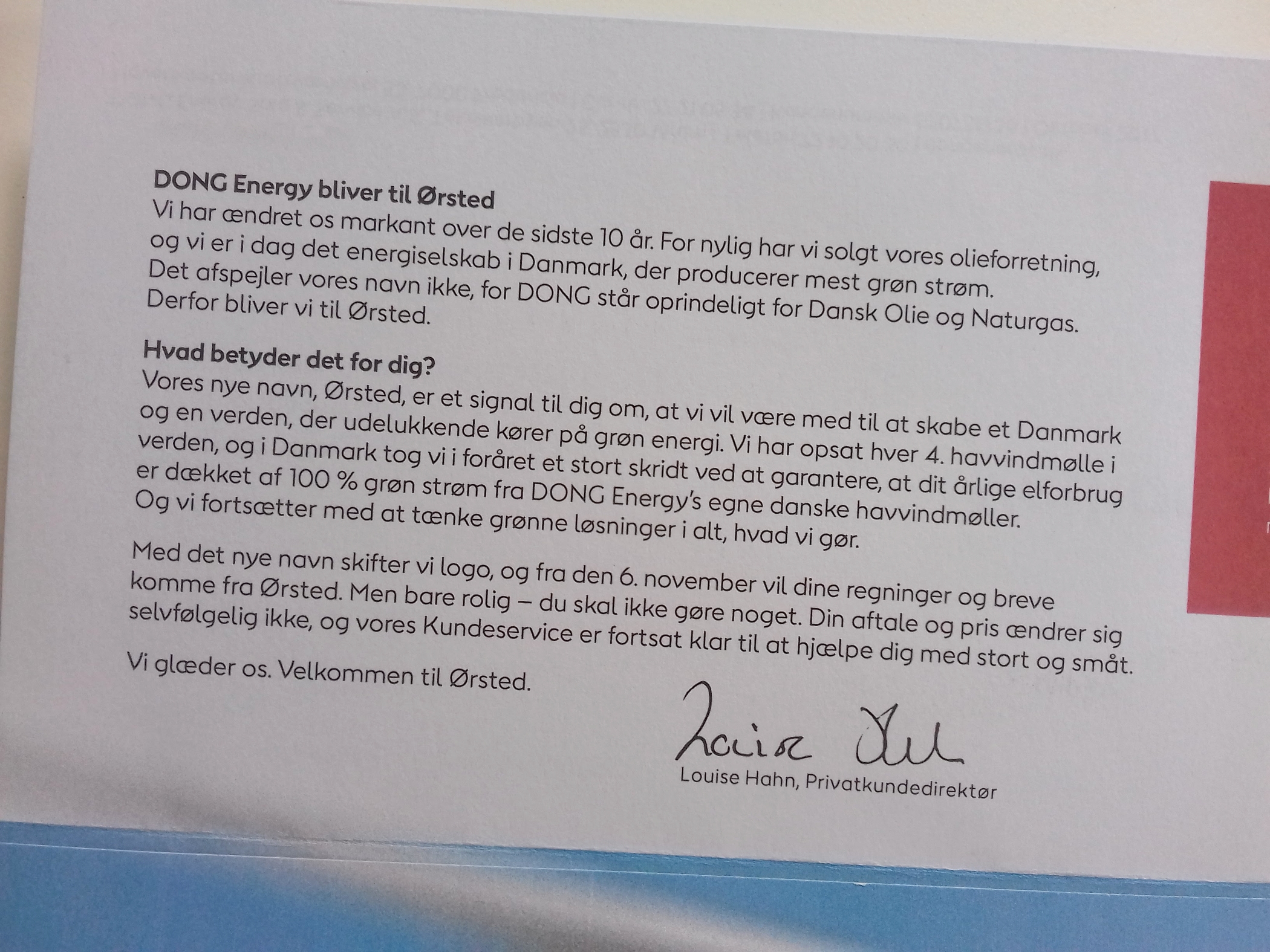
It also isn’t good if the supposedly important message points in different directions. For danish readers, here’s the message of DONG becoming Ørsted, as presented to a web visitor – a polished declaration of intent that might as well come from a startup, and very little information at first glance. Meanwhile, the picture there is a letter to their customers, projecting a different message which includes some foundation in history and some relevant facts. Here’s a third version from the bureau who handled the rebranding. The versions aren’t in conflict, exactly, but they also aren’t aligned very well. As a personality, the brand is flimsy – there’s no fixed point.
And here’s the clothing brand “Happy Shop”, whose models all look like they’re on the verge of suicide. Even the web address contains “happy” – twice! – but there’s absolutely nothing happy about their images or impression. Maybe they’re being ironic?
Branding today is Human-to-Human, maybe to a greater extent than anything else going on in the business. This means that we have to put considerable energy and dedication towards issues like what we’re supposed to be doing for our audience, how we appear to their eyes, what their contexts for us are, and so on. At least as much energy and effort as we invest into what we want to say and how we want to look.
Incidentally, this often means being challenged in your self-perception – but as good design-thinkers we’re not going to consider this a threat, but rather as an opportunity for improvement. Because that’s what it is.